Applying Responsive Web design to an ASP.NET MVC
application
Tools required: (minimum)
A responsive design is a design that responds elegantly and smartly
to your device screen resolution, doesn’t matter if that is a tablet,
smartphone, tv or a desktop computer.
In that sense, there is more than one way to achieve responsiveness when
developing web applications. The most common (mistake) is to create separate set
of views for each type of device (or even dedicated views for each brand of
devices: iPhone iPad etc... in the worst of the cases) smartphones, tablets,
desktops and TVs – There might be cases where the technique applies (I haven’t
encounter one yet, but there might be more than one proponent that argues about
a case that merits the use of multiple views)–, another is to create a
completely separate web application for “mobile devices” (sometimes decently
shown as a part of a two menu options: View mobile site and View full site), and
the tablets are left retrieving the desktop-like website. And the third one
(the one I prefer) is a Responsive Design (AKA Responsive Web Design/RWD)... I
like to think of a design that is device
agnostic; iPhone, iPad, Surface, Windows phone, we don’t really care about
this but we’ll take in consideration each category: smartphones, tablets,
desktops, TVs, etc.
To achieve a responsive design it is important to know the existence
of the viewport
meta tag. Also, it is important to think responsive minded and by
that I meant to recognize that we cannot offer the same user experience in a
mobile device as in a desktop environment, but we can think about the screen as
our playground, a playground without fixed measures and so we give it a
proportional measure equal to 100% and its children parts or sections a
percentage of their parent section, instead of giving fixed measures in pixels
as is the common practice when develop website for desktop environments.
Moreover is important to know that we can also use mediaqueries (draft doc) and media
types to handle
specific scenarios and accommodate the content accordingly thought using CSS.
View port meta tag.
The view port meta tag has to be placed in the header of your html
document. For more info about it click here.
I.e.
<html>
<head>
<meta name="viewport" content="width=device-width" />
<title>View port test</title>
</head>
<body>
</body>
</html>
Think responsive/Think
proportional
Our playground/our screen:

A classic layout
A classic layout looks like the following. My example resembles a
university website; none in specific...
There is a practice known as mobile first to create beautiful responsive designs, but I believe
that if you are transitioning from developing traditional websites for the
desktop audience then it is better to start from a desktop perspective and down.
It is important though to
acknowledge that a mobile user is not a user that owns a smartphone and/or a
table, a mobile user is a user that spends most of its surfing-the-web time in
a table/smartphone otherwise it is a desktop user that owns a mobile device and
perhaps he/she is not yet a user that belongs to that niche market, in
consequence not yet familiar with the differences between the mobile-UI
experience and the desktop-UI experience and not the right person to get
feedback from when planning your design, with this factor in mind you will also
encounter resistance to change when transitioning
to adopt a responsive design.

Responsive minded
(Think proportional/Think responsive/Think of your audience –your audience
expects to enjoy a mobile experience in a mobile device not a desktop
experience in a mobile device )

What about
height? My two cents, is that unless you need a fixed height, it is a good
thing to leave height = auto.
If you
have already a layout defined in pixels (px) you can transform those px into %
using a simple but very handy formula.
I.e. Let’s
say that the main area of your current design (or the screen) is based on a
resolution equal to equal to 1366 pixels (width=1349/playground width=100%) and
the logo section has a width equal to 341 px (width=? proportional), then the
formula to apply would be the following:

341 x 100
/ 1349 = 25.27798369162342 (%).
We have
just determined the proportional measure (%) of the space occupied by the logo
section in the site. Having defined the logo’s width in percentage makes the
logo responsive to different screen resolutions. This is only a step in our
goal to achieve a responsive design. It is important that when you resolve a
resolution from an already defined measure in pixels that you don’t remove or
round the decimals, after all that’s the exact measure you want to see when the
browser parses your design.
Media
queries and Media types.
Media
queries and media types allow us to define more specific style sheets for different
device resolutions.
@media only screen and (min-width: 1441px)
@media only screen and (max-width: 1279px) and (min-width: 768px)
@media only screen and (max-width: 767px)
@media screen and (orientation: landscape)
@media screen and (orientation: portrait)
1)
Planing our Responsive Design – The desktop view.

Mobile layout ( Tablets/Smartphones)
Tablet – portrait

Tablet – landscape

We will
find always a person during a RWD discussion who argues that responsive web
design is not feasible because tablets/smartphones offer higher resolutions
than our design plans... fair enough, so we use viewport meta tag: The viewport meta tag tells the device at what scale to render the
page.
Phone – portrait

Smartphone– landscape

2) Creating an ASP.NET MVC project.
Open Visual studio and
create a new project >> ASP.NET MVC Web Application >>
Name: ResponsiveDesignDemo >>
Template: Basic
Note: This
document focus on building a responsive design for an ASP.NET MVC application,
but the essential part that is CSS can be used in any other platform (Web
forms, PHP, Rails, etc.).


3)
Implementing our responsive design. Click on top of the
folder Content and select Add >> New Item >> Web
>> Style Sheet and name it ResponsiveDesign.css.


4)
Copy the following CSS in the file you’ve just created.
body
{
margin: 0 auto;
font-size: .95em;
font-family:Consolas;
background-color:white;
width:100%;
height: 100%;
}
.header, .footer
{
width: 100%;
max-width:100%;
display:block;
margin:0 auto;
clear:both;
}
.section
{
width: 100%;
max-width:100%;
display: block;
margin: 0 auto;
clear: both;
}
.logo
{
float:left;
width:25%;
display:block;
}
img
{
max-width: 100%;
}
.topMenu
{
float:right;
width:75%;
}
.topMenu ul { margin-left: 0; display: inline; height: 35px; line-height: 15px; list-style: none; }
.topMenu ul > li { float: right; }
.topMenu ul > li a
{
text-decoration:none;
color:cornflowerblue;
font-size: 1em;
height: 25px;
line-height: 28px;
padding: 0 15px;
cursor: pointer;
border-right: 1px solid rgba(0, 0, 0, 0.347656);
}
.topMenu ul > li:hover a { color:blueviolet }
.companyName
{
width: 100%;
font-size:1.3em;
margin: 2px 0 1px;
}
.mainMenu
{
height: 35px;
background-color:dodgerblue;
}
.ui-controlgroup
{ width:100%; margin-left: 0; display: inline; height: 35px; line-height: 15px; list-style: none; }
.ui-controlgroup
{ float: left; }
.ui-controlgroup
a
{
float:left;
text-decoration:none;
color:midnightblue;
font-size: 1em;
height: 25px;
line-height: 28px;
padding: 0 15px;
cursor: pointer;
border-right: 1px solid rgba(0, 0, 0, 0.347656);
}
.ui-controlgroup :hover a { color:deepskyblue }
#mainContent
{
width: 100%;
display: block;
clear:both;
}
.leftContent
{
float:left;
width:70%;
min-width:500px;
}
.section > .img
{
float: left;
width: 24%;
}
.section > .news
{
float: right;
width: 72%;
margin-right:1%;
}
.rightContent
{
float:right;
width:30%;
}
.footerLink
{
float:left;
display:block;
width:25%;
height: 34px;
background-color:#EBDFE4;
}
.footerLink a
{
padding:10px 20px 10px, 13px;
margin:-2px 0;
display:block;
text-align:center;
}
@media screen and (max-width:900px)
{
body
{
font-family:'Arial Rounded MT';
}
.mainMenu
{
width:100%;
background-color:white;
}
.leftContent
{
float:left;
width:100%;
}
.rightContent
{
float:right;
width:100%;
}
.ui-controlgroup > a
{
font-size:.75em;
height: 45px;
}
.footerLink
{
width:49%;
float:left;
margin-bottom:2px;
margin-right:1px;
}
.footerLink a
{
background: url(/content/images/mobileArrow.png) no-repeat scroll right center transparent;
display: block;
margin: -2px 0;
word-wrap: break-word;
}
}
@media screen and (max-width:510px)
{
body
{
font-family:'Arial Rounded MT';
}
.mainMenu .ui-controlgroup
{
display:block;
height:auto;
}
.ui-controlgroup > a
{
font-size:.75em;
width:50%;
min-width:50%;
padding: 0 0;
}
.footerLink
{
width:99%;
float:left;
margin-bottom:2px;
margin-right:1px;
}
}
I believe the CSS self
descriptive, but note how we gave proportional measures to our design instead
of fixed measures in pixels, also note the use of the media queries, they will
take effect once a device (even the desktop) hits those resolutions.
@media screen and (max-width:510px)
@media screen and (max-width:900px)
5)
Seek for the default _layout.cshtml created for us in the
project (go to Views >> Shared folder), open it and add the
following markup.
<!DOCTYPE html>
<html>
<head>
<meta charset="utf-8" />
<meta name="viewport" content="width=device-width" />
<title>@ViewBag.Title</title>
@Styles.Render("~/Content/css")
@Scripts.Render("~/bundles/modernizr")
<link rel="stylesheet" href="http://code.jquery.com/mobile/1.0a4/jquery.mobile-1.0a4.min.css" media="only screen and
(max-width:900px)">
<script src="//ajax.googleapis.com/ajax/libs/jquery/1.9.0/jquery.min.js" type="text/javascript"></script>
</head>
<body>
<div class="header">
<div class="section">
<div class="logo">
<a href="@Url.Action("Index", "Home")">
<img src="~/Content/Images/MyLogo.png" />
</a>
</div>
<div class="topMenu">
<ul>
<li><a href="#">Link1</a></li>
<li><a href="#">Link1</a></li>
<li><a href="#">Link1</a></li>
<li><a href="#">Link1</a></li>
</ul>
</div>
</div>
<div class="section">
<div class="companyName">
Responsive Design Company Ltd
</div>
</div>
<div class="section">
<div class="mainMenu">
<div data-role="controlgroup" data-type="horizontal" class="ui-corner-all
ui-controlgroup ui-controlgroup-horizontal">
<a href="@Url.Action("Index", "Home")" data-role="button" data-theme="b" class="ui-btn ui-corner-left ui-btn-up-b">
<span class="ui-btn-inner
ui-corner-left">
<span class="ui-btn-text">
Home
</span>
</span>
</a>
<a href="#" data-role="button" data-theme="b" class="ui-btn
ui-btn-up-b">
<span class="ui-btn-inner">
<span class="ui-btn-text">
About
</span>
</span>
</a>
<a href="#" data-role="button" data-theme="b" class="ui-btn
ui-btn-up-b">
<span class="ui-btn-inner">
<span class="ui-btn-text">
Academics
</span>
</span>
</a>
<a href="#" data-role="button" data-theme="b" class="ui-btn
ui-btn-up-b">
<span class="ui-btn-inner">
<span class="ui-btn-text">
Research
</span>
</span>
</a>
<a href="#" data-role="button" data-theme="b" class="ui-btn
ui-btn-up-b">
<span class="ui-btn-inner">
<span class="ui-btn-text">
Campus Life
</span>
</span>
</a>
<a href="#" data-role="button" data-theme="b" class="ui-btn ui-btn-up-b
ui-corner-right">
<span class="ui-btn-inner
ui-corner-right ui-controlgroup-last">
<span class="ui-btn-text">
Responsive
</span>
</span>
</a>
</div>
</div>
</div>
</div>
<div id="mainContent" >
@RenderBody()
</div>
<div class="footer">
<div class="footerLink">
<a href="#">Maps</a>
</div>
<div class="footerLink">
<a href="#">Job Opportunities</a>
</div>
<div class="footerLink">
<a href="#">Directories</a>
</div>
<div class="footerLink">
<a href="#">Parents</a>
</div>
</div>
@Scripts.Render("~/bundles/jquery")
@RenderSection("scripts", required: false)
</body>
</html>
6)
Right click on Controllers, select Add >> Controllers...
>> Controller name: HomeController >> Template: Empty MVC
Controller.


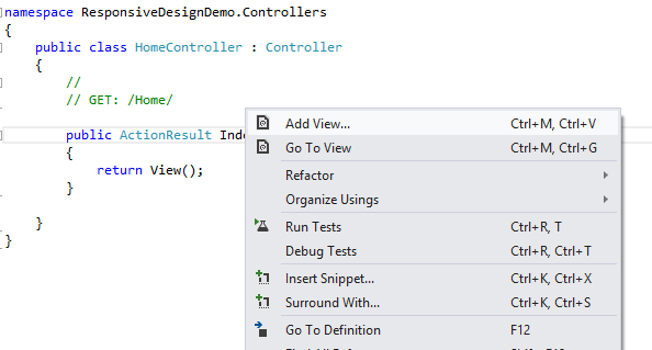
7)
Open the controller you’ve just created, right click in the
only action method available and select Add
View...
View Name:
Index >> View engine: Razor >> use layout or master
page: _layout.cshtml

8)
In the view Index.cshtml recently created, replace the
default code with the following:
@{
ViewBag.Title = "Index";
Layout = "~/Views/Shared/_Layout.cshtml";
}
<div class="leftContent">
<div class="section">
<h2>Responsive Design News !</h2>
<img src="~/Content/Images/RWD.png" />
<div class="news">
<p> Responsive Web design has been
evolving rapidly ever since Ethan Marcotte coined the term two years ago.
...Lorem ipsum dolor sit amet, consectetur adipiscing elit. </p>
</div>
</div>
<div class="section">
<h2>Go Responsive</h2>
<img src="~/Content/Images/RWD.png" />
<div class="news">
<p>Lorem ipsum dolor sit amet,
consectetur adipiscing elit. Pellentesque ut ultrices mi. Integer nisl mauris,
mollis nec rhoncus sed, lacinia placerat leo. Vestibulum ante ipsum primis in
faucibus orci luctus et ultrices posuere cubilia Curae; Donec eget ante tortor,
eu vestibulum diam. Sed id nibh orci. Morbi commodo venenatis dictum. Maecenas
egestas tincidunt arcu eget suscipit. Suspendisse potenti. Donec porttitor
suscipit ante ornare auctor. Nulla augue nibh, cursus at rhoncus in, porttitor
eu purus.</p>
</div>
</div>
</div>
<div class="rightContent">
<h4>Responsive design !!</h4>
<p>This is just a basic demo of what
you can do with RWD.</p>
<h4>Lorem ipsum</h4>
<p>Lorem ipsum dolor sit amet,
consectetur adipiscing elit. Pellentesque ut ultrices mi. Integer nisl mauris,
mollis nec rhoncus sed, lacinia placerat leo. Vestibulum ante ipsum primis in
faucibus orci luctus et ultrices posuere cubilia Curae; Donec eget ante tortor,
eu vestibulum diam. Sed id nibh orci. Morbi commodo venenatis dictum. Maecenas
egestas tincidunt arcu eget suscipit. Suspendisse potenti. Donec porttitor
suscipit ante ornare auctor. Nulla augue nibh, cursus at rhoncus in, porttitor
eu purus.</p>
</div>
9)
Right clic on the Content
folder and add a New Folder and name it Images, we will be placing there 3
images we need for our demo.

10)The following images
are for reference, you can create your site with your own images. If you decide
to go using the following images, just save them in the folder (Images) you’ve
just created.
mobileArrow.png

MyLogo.png

RDW.png

11) Include the images in your project by clicking the icon shown in the image below to Show All files and then right click on
each image and select Include in Project

12) Press F5, re-size your
browser or fetch the project from a table/smartphone and see the opportunities
you have at your feet J... if you find the
demo a bit (or a lot) buggy you are in the right path, please tweak it or
change it the way you want and take advantage of the practice… it can save some
bucks to your clients.
Desktop view
Screen shoot

Tablet view


Smartphone
Screen shoot

Screen shoot

Screen shoot

Considerations
This is just a basic demo that hopefully will help you discover new opportunities
to create beautiful web solutions.
I learned about RWD first from Bootstrap and foundation (Zurb) projects...
(watch and learn) Later a friend of mine shared me a link that talked about
Responsive design and the Ethan Marcotte’s work... check out his book and other books in the market.